The unexpected use-case
Here I took a mobile-first approach at redesigning an out-of-date facility alert system.

First things first
Purpose- To reimagine how the US Open Alert System functioned as a whole. This app would facilitate in resolving logistical issues, escalated threats and weather related play decisions.
Audience- Vendors and USTA staff that would be on-site at the annual US Open tournament. Also used by CEO, COO to keep a pulse on event happenings.
My Role
-
Translating business requirements into lo-fi wireframes
-
Collaboration with product owners on how and when the app would be used
-
Creating hi-def mock ups of the prototype
-
Branding (typography & colors)
-
Facilitate hand-off to developers
Approach
"The UI should be simple and easy to navigate with a modern design." Those were the words of the project manager.
She sent me a doc that contained requirements for the new app and screenshots of the existing portal. The system as it was, was outdated and cumbersome. The grey interface was riddled with usability issues and visual blindness due to the many form fields and buttons that were poorly placed.
My goal was to design an interface that was bold where needed and neutral where not.

Constraints
My biggest challenge with this project was time. I was given a 3-week runway to submit final designs.
Working for an older organization like the USTA you come across some stakeholders who do not think user feedback to be as important. Some even, like in this case, consider user testing as a set-back and unnecessary expense.
I overcame this hurdle by doing my duty as a designer and making the benefits of testing as clear as possible. The product manager offered to test the prototype with her team, even though this was not the best feedback for me.


Solutions & Results
I was able to rapidly build a prototype on Sketch
solely based on UX/UI best practices. There was no room for a long thought out design process. I highlight this to show that I fundamentally believe in the design thinking models available to us, but adaptability to circumstance is very important.
The prototype included:
-
Enhanced communications through email, in-app and push notifications.
-
Strong brand presence throughout the design.
-
Intuitive calls-to-action.
-
Clear indication of severity level for the alerts created and broadcasted.
The US Open Alerts system was a multi-layered project that required a great deal of collaboration across teams in a short period of time.
It was the glue that held on-site operations together. If there was a vendor issue, inclement weather conditions or no toilet paper in the facilities, the app was there to help notify the proper teams.
The most fulfilling use for me however, was that the app played an important part in notifying all staff of Covid related happenings.
Some of these were contact tracing, vaccination sites, times and capacity levels of certain areas.
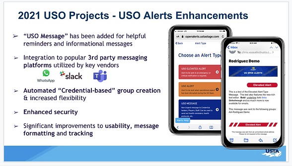
Here is a slide of some enhancements that were slated for 2021: